Color Coding for Clarity (Calendar Time Management, Part 3)
For my third post on how I use my calendar as a tool to manage my time, I thought I’d write about something more fun: color! I color-code my calendar events to help me see what events are meetings and when I’m working on which project. Yes, that’s right even though my first post focused on how calendar events are all time commitments, that doesn’t mean I threw out the ability to quickly see my meetings!
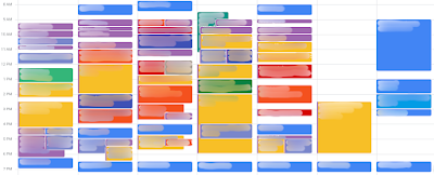
Since a picture can help regardless of how many words I use, here is a blurred-out version of my calendar from a few weeks ago:
Meetings events are bold colors
To make it easy to see which of my events are meetings, I use dark or vibrant colors. Using this color coding, I can quickly scan my calendar to know what events are meetings that cannot move unless I coordinate with someone first. Versus what events are work sessions that I could potentially move around as needed. I do all of this using Google Calendar.
If you have access to the enterprise version, which I do, you can also label these colors and get insights about your calendar. I don’t really use this insights feature (maybe someday). But I did add labels since it wasn’t that much effort. For colors that represent meetings, I called it “<project> Sync,” while non-meetings are called “<project> Async.” I use this labeling to make it clearer to myself what events have to happen at that time.
Color-coding by category
Admittedly, Google Calendar has a limited color palette. In some ways, this is probably a good thing since my calendar would be an even wilder burst of colors than it currently is. Technically, I could put events on different calendars with any color I want. But I only do that at the level of separating my work calendar, family calendar, and personal calendar. Having a separate calendar per category would be too much.
To handle the limited color palette, I limit my color coding to a few categories.
- Each class I teach gets a color pair. I usually juggle two classes at once at any given time, so I use (light green, dark green) and (yellow, orange) for each class. Light green and yellow are for working on the courses, while dark green and orange are for meetings, class time, or any other synchronous time.
- All personal projects are (light blue, dark blue) these events are for research, my podcast, blog, daily buffer time, monthly reflections, etc. Light blue events are when I plan to work on that project, while dark blue usually is meetings.
- General stuff like my daily reading/writing time, email, etc. are the calendar’s default color of light purple.
- Meetings for service work are dark purple. This is mainly for service outside of Duke, such as when I was the hybrid chair for SIGCSE TS. Now that my work for them is almost done, I’ll likely change what this color means.
- Meetings for Duke service are red. These include committee meetings, advising students, etc.
- For personal not-work-related events, I use (regular blue, peacock blue). Regular blue is the default color for my separate personal Google Calendar, and I chose that color to make it distinct from the blues I use in my work calendar. The peacock blue is an attempt to make it clear this is a meeting that is non-work related, though sometimes it’s hard to see the difference.
- For family events, I use green, which is distinct from the other greens, and it is the default color I put in for that separate Google Calendar.
As I write this list, I realize I’m not as consistent as I thought in my color schemes. One could argue that the yellow is rather bold. However, even if it were easy to change (which it isn’t), I wouldn’t do it. Certain colors have certain meanings to me, like blue is my favorite color, so using it for personal stuff makes sense. In addition, I’ve used these colors for so long that each of those colors now really does mean that category, and retraining my brain doesn’t seem worth it. If I had to start from scratch, I would rethink some things, like the (yellow, orange) pair for a course would change to (red, pink) in the Google Calendar color palette.
Conclusion
So there you have it, short and sweet this time. This post is brief, but I hope it’s also been helpful. One more post to go that will focus on how I update my calendar over time. If you use colors differently than I do, I’d love to hear what you do!

Comments
Post a Comment